Problem Statement:
Individuals in shared households struggle to coordinate chores, expenses, and communication, resulting in misunderstandings, perceived unfairness, and ongoing friction in day-to-day living.
The Solution
Develop an app that enables roommates to collaboratively manage tasks, track expenses, and coordinate schedules efficiently. Address the diverse challenges of shared living, such as ensuring fairness, encouraging collaboration, and simplifying household logistics.

Gamified chore management, suitable for families and roommates. Limited features beyond chore management.
Tailored for roommates and families, with calendars and group chats. Ads in the free version reduce usability.
Reduces food waste with inventory management and meal planning. Limited platform compatibility and cross-device synchronization.

All-in-one household management with chore management and shared shopping lists. Limited customization and occasional bugs.

Fair expense tracking with transparent payment tracking and detailed financial summaries. Limited features beyond expense tracking.
Quantitative Research
A Google survey completed by 10 individuals with ages ranging from 20 to 40 with different educational backgrounds and
ethnicity was used to identify where conflict most commonly occurs in shared households and how responsibilities are currently managed.
Cleaning and grocery conflicts (unequal effort, shared food)
Poor proactive communication (schedules, visitors, expectations)
One roommate carries more responsibility without compensation.
High frustration ≠ low satisfaction
→ Despite task frustration, 70% rate household satisfaction as 4–5/5.
→ People tolerate issues if the household “mostly works.”
Good communication = fewer task issues
→ Strong correlation between clear communication and smoother task management.
Chore & responsibility clarity → rotations, visibility, accountability.
Shared calendar as a central feature → improves planning & reduces surprises.
Financial transparency tools → expense tracking + fairness.
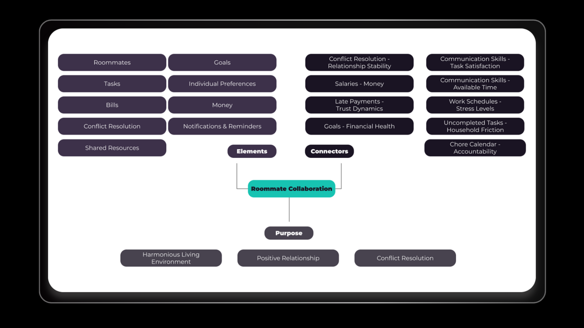
Households don’t fail because they’re chaotic; they fail due to unclear responsibility, communication, and fairness. This insight informed the design of an app that centralises expense management, fair chore division, and roommate communication.
During competitor research, I found that while many apps address expenses or chores, none offered clear refund history tracking, despite roommates frequently covering costs for one another. Introducing this feature reduces financial conflict, improves accountability, and builds trust, creating a clear point of differentiation.
Define Phase
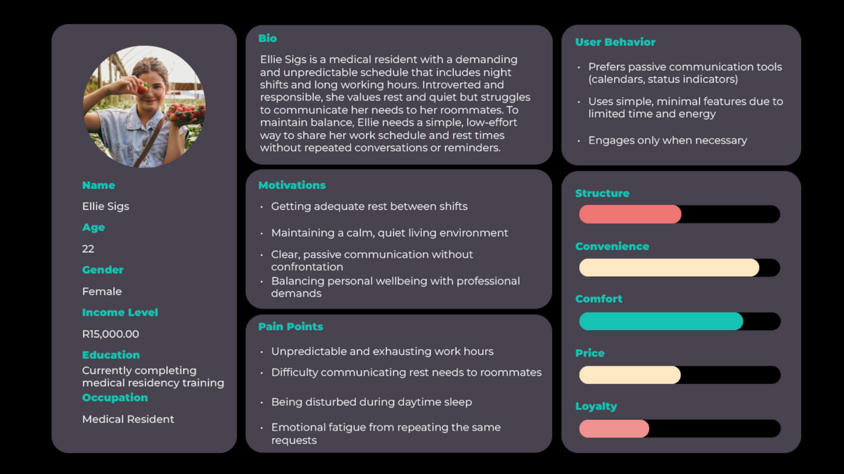
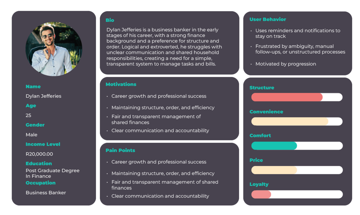
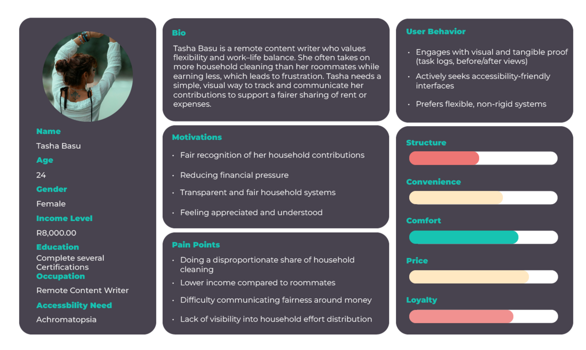
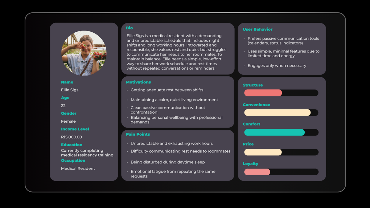
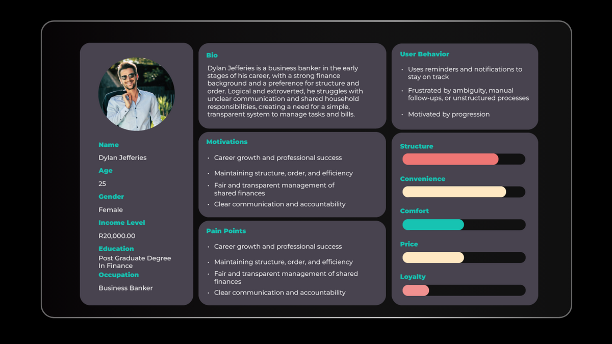
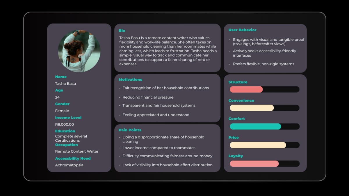
After completing my user research, I created three personas with different user goals, frustrations,
and personalities to help develop an equitable design. Though all the personas were important, Tasha was the primary focus.
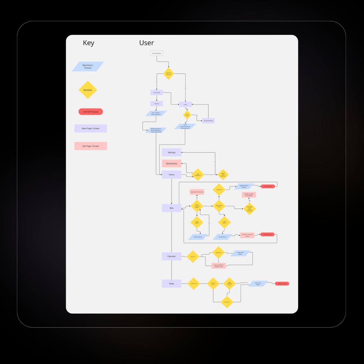
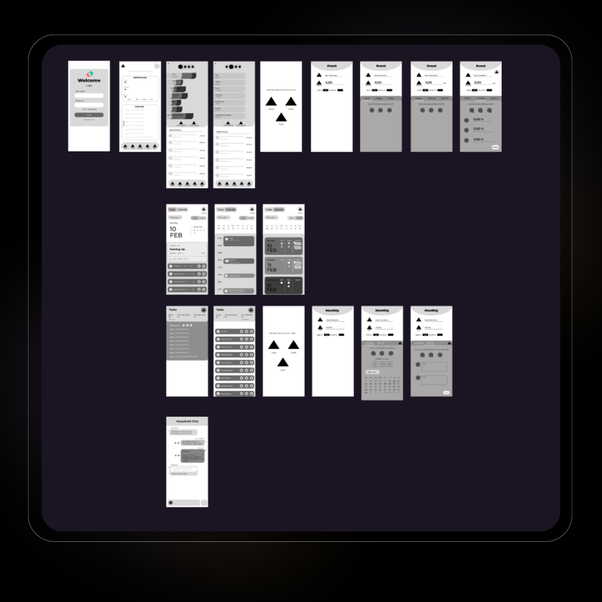
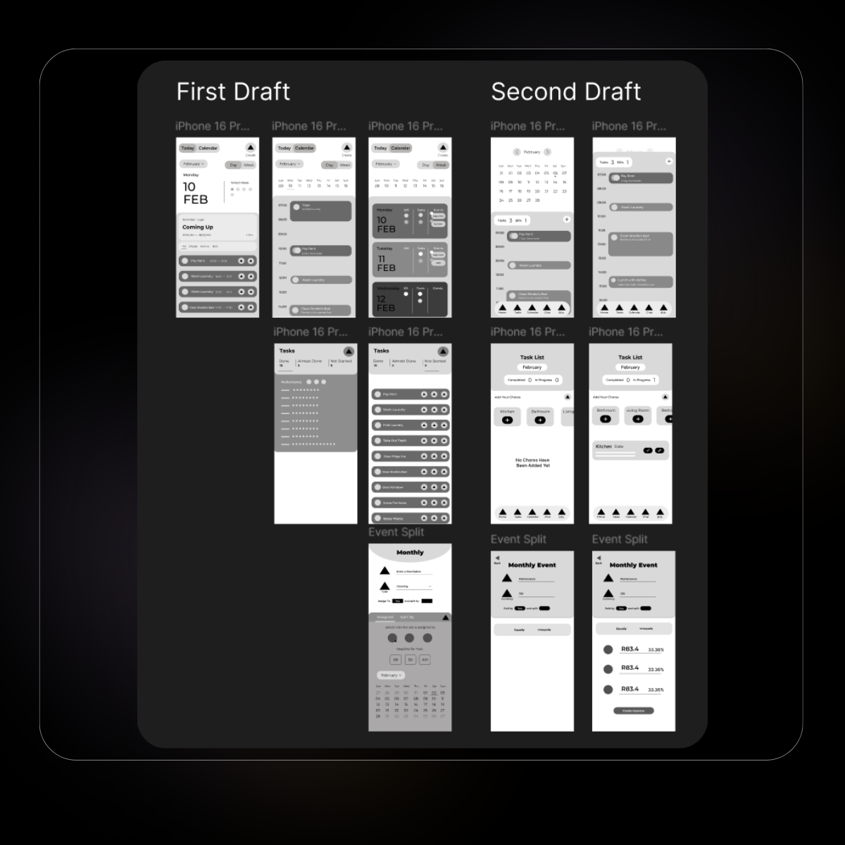
These wireframes represented an initial exploration of the interface. Early iterations introduced unnecessary visual noise, which risked reducing clarity, particularly for accessibility-focused users. This led to a strategic decision to leverage established UI patterns from competitor research, prioritising familiarity and usability over novelty.
Based on these findings, a second iteration focused on reducing visual complexity and strengthening hierarchy to improve scanability and accessibility
Based on these findings, a second iteration focused on reducing visual complexity and strengthening hierarchy to improve scanability and accessibility
To validate core functionality and navigation patterns, usability testing was prioritised before moving into high-fidelity design.
Usability Test 1
Four unmoderated participants aged 20–26 were included in the study. Participants came from diverse educational backgrounds, had no prior experience with usability testing, and had lived experience of shared housing. Their eyesight varied, ranging from corrected vision (glasses) to uncorrected vision where participants felt they may require visual assistance.
The initial testing phase focused on validating baseline usability with users familiar with roommate living. A second, dedicated testing phase evaluated accessibility and validated inclusive design decisions with users experiencing visual impairments.
Finding 1:
Participants were able to navigate the app independently.
Finding 2:
While some users experienced confusion due to microcopy, all participants were able to understand and navigate the core features independently.
Finding 3:
All of the participants felt that the project had emphasized the correct pain points. Participants identified the refund feature as unexpectedly valuable, particularly for temporary group expenses such as holidays or shared events.
Finding 4:
All of the participants expressed that they felt the UI was very clean and simple.
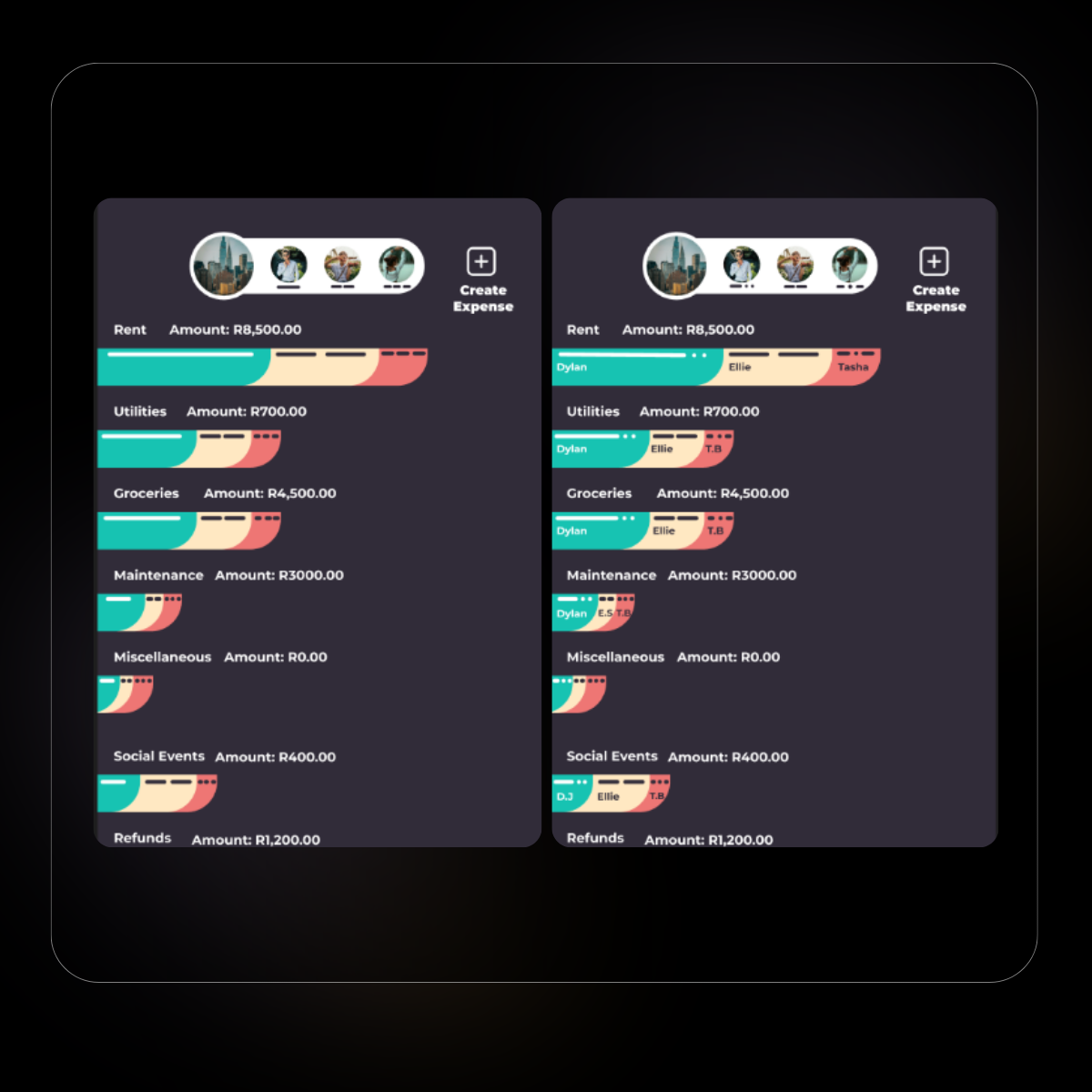
Accessibility was a core consideration throughout the design process to empathise with Tasha. All colour combinations meet a minimum contrast ratio of 4.5:1, ensuring key elements remain visible for users with visual impairments. To further support users who struggle with colour perception, visual graphs rely on pattern recognition and clear labelling, rather than colour dependency, so information can be understood at all times.
A simple, uncluttered UI was prioritised to support not only users with visual impairments, but also overall ease of use and cognitive clarity. The app includes both light and dark modes to support personalisation and reduce visual strain in different environments.
The placement of information-bearing elements was carefully considered. Critical information, such as data on progress bars, is always visible. Form fields include clear headings, inline input guidance, and error messages placed below the field, ensuring errors are noticed without disrupting the reading flow.
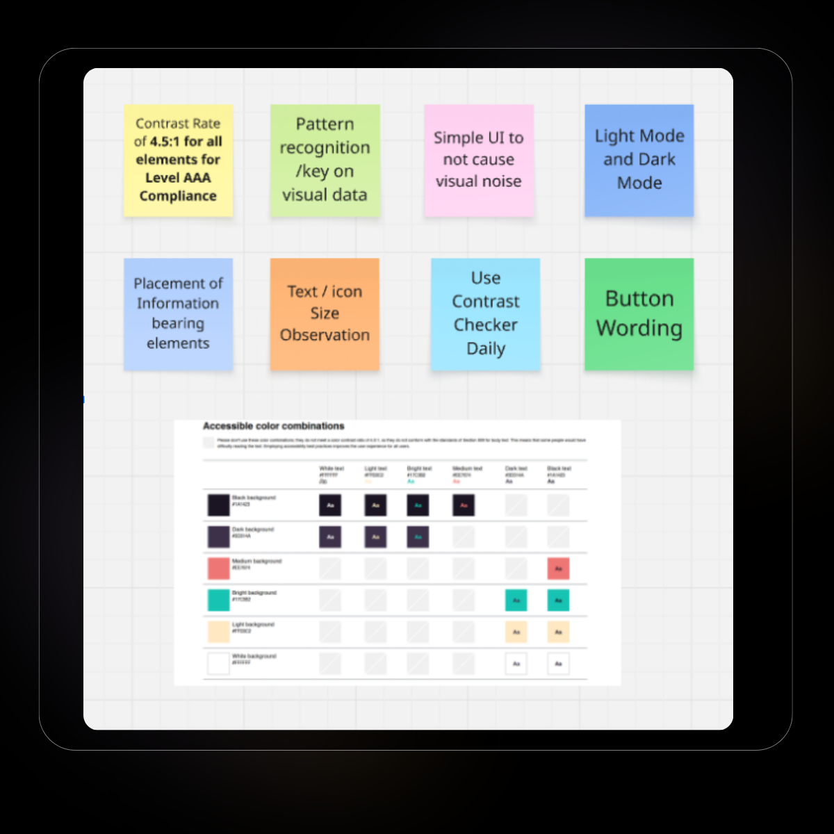
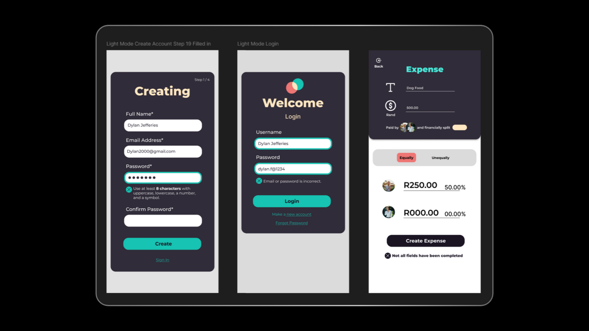
Text sizing was designed for readability across the interface. In areas where smaller text under 14px was unavoidable, a bold font weight was used to improve legibility and visibility.
Contrast checking was a daily part of the design process, with the goal of achieving AAA compliance wherever possible. Button labels and action copy were written with clarity in mind, clearly explaining what will happen next. This avoids vague “Yes/No” choices and helps users quickly understand and select the correct action, especially in time-sensitive situations.
Usability Test 1
Purpose: The purpose of phase 2 was to determine whether the accessibility principles I had implemented would work for users. I had 4 participants with varying eye impairments and ages from 20 - 60 (normal vision, eye impairments from old age, deuteranopia, and tritanopia).
Finding 1:
Users asked for a bit more help with visual data, as they weren’t immediately able to identify it.
Finding 2:
The oldest participant struggled with some of the wording/directions, but the younger participants were able to navigate the app without problems. This indicated that the design was more intuitive for younger users, highlighting an opportunity to improve clarity and guidance for older users.
Finding 3:
All participants were able to navigate the app independently.
Finding 4:
Users expressed differing preferences around the visibility of chores and financial information.
Finding 5:
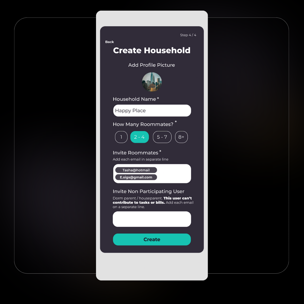
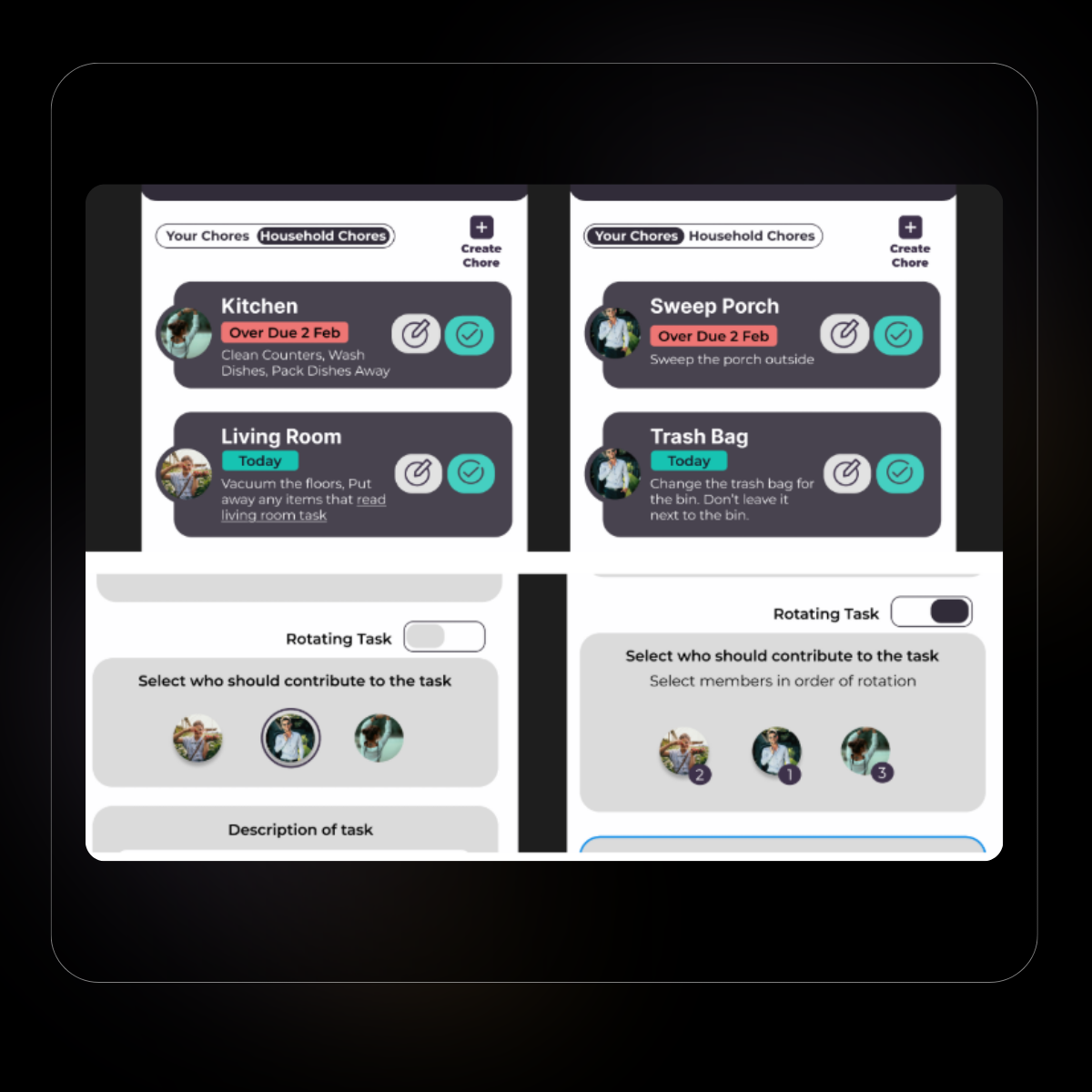
There were smaller features that some users wanted that were not brought up in usability test 1, which included task rotation, non-participating users for “dorm parents”, and an option to export the chat.
1. I created more dynamic patterns and put the users' names in the section for better clarification.
2. I created a non-participating user to view the household as an objective external party.
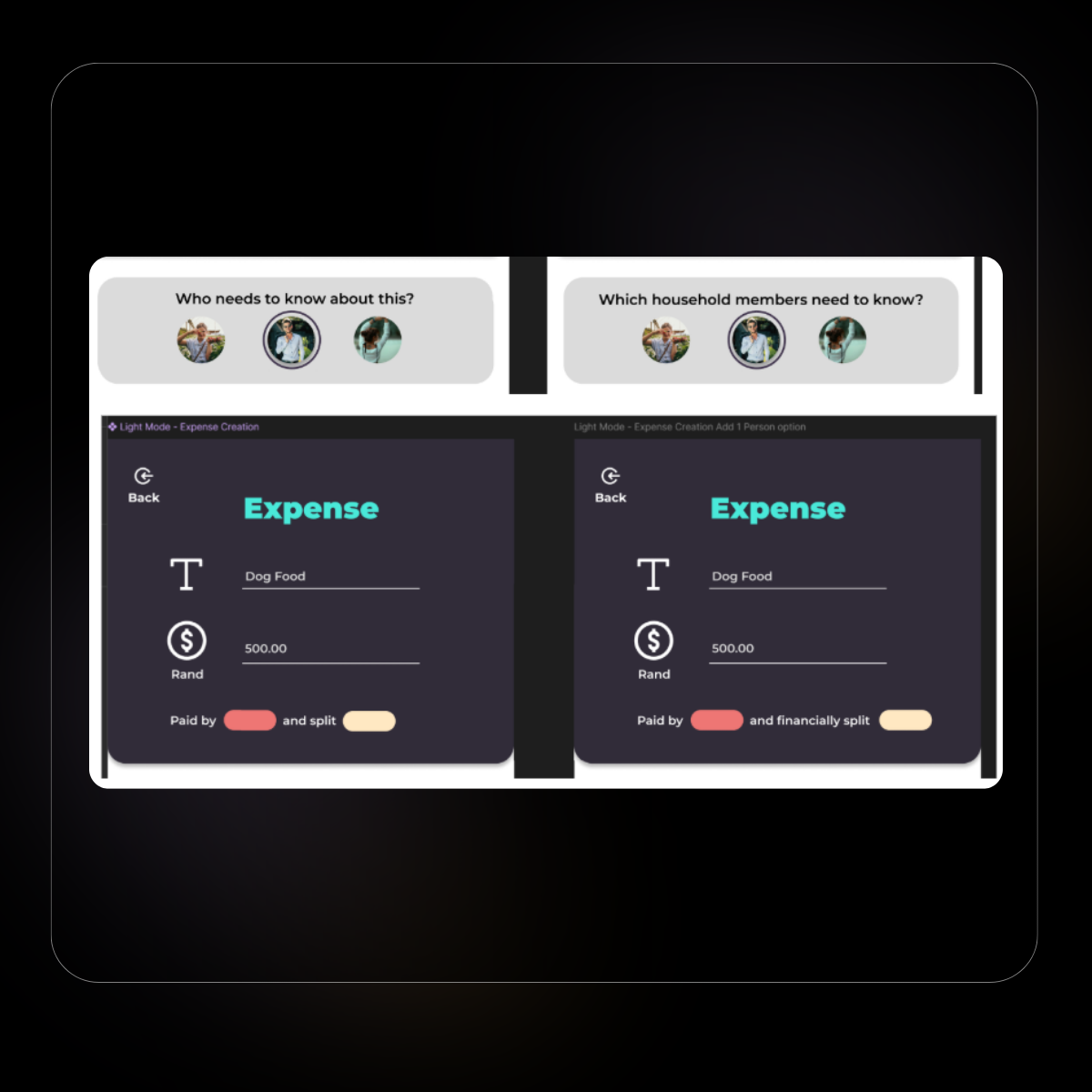
3. Microcopy and labels were refined to improve clarity and reduce cognitive load during task completion.
4. Created more personalised sections on the chore features
What I’ve learned
This project highlighted the value of rapid ideation methods, such as Crazy Eights, earlier in the design process to accelerate exploration and reduce time spent refining initial concepts. Additionally, recruiting participants with specific accessibility needs proved challenging, emphasising the importance of initiating participant recruitment early when working with specialised user groups to avoid delays in later stages.