Problem Statement:
Many women experience recurring symptoms and cravings throughout their menstrual cycle but lack clear, practical guidance on how to adapt their diet to different phases or understand why these changes occur.
The Solution
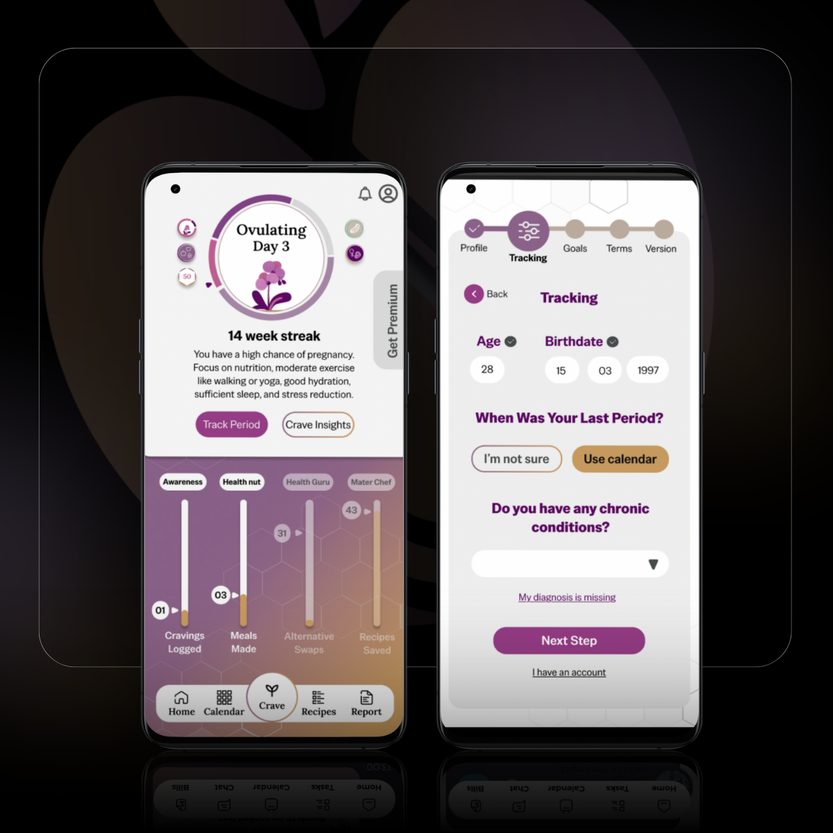
Crave It provides menstruating women with structured guidance to align their diet with their menstrual cycle, combining education, tracking, and personalised insights to support better body awareness and wellbeing.
Quantitative Research, Competitive Analysis
A Google survey completed by 27 women with ages ranging from 19 - 59, different educational backgrounds, and ethnicity was used to identify what user behavior women had towards motivation /progress tracking features, period tracking, craving & food choices, and how users receive follow-up medical guidance for their diet.
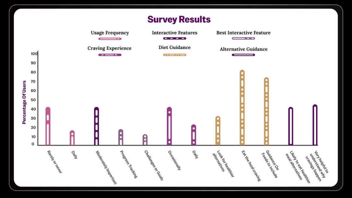
Users need features that motivate them to use the app
The highest rated features to motivate users were progress tracking, goals, and challenges.
Users are given instructions on what to include in their diet rather than a specific diet
Most users are likely to use the app if they can get a quick and easy alternative to their craving
Users felt it would be very helpful to understand their cravings as well as symptoms
User Craving = Low effort, unhealthy meal
→ Users don’t know how to make healthier alternatives for their cravings
Quick, Easy Alternative To Craving = User makes Alternative
→ If a better option is available, users are more likely to eat it than an unhealthy meal
Alternative Recipe Function - Gives users alternative options
Swap Function - Substitutes an ingredient to help create the best meal for the user
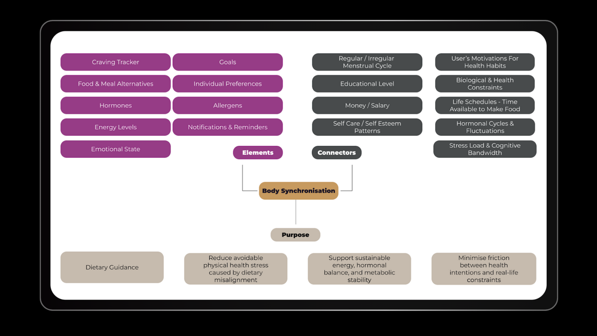
Period and Diet synchronisation - Gives users insights into why and what they are experiencing
These products confirm demand for cycle-aware guidance but reveal limitations around flexibility, accessibility, and everyday usability.
Holistic cycle-syncing app combining period tracking with phase-based nutrition, movement, and mood insights.Strong concept, but limited cycle customisation, symptom depth, and user complaints due to inappropriate advertising.
Cycle-tracking app focused on hormone education, cravings, and phase explanations. Promising direction, but still in beta with no validated user feedback.
Science-driven cycle-tracking app designed for athletes to optimize training, recovery, and nutrition.Effective for performance use cases, but limited accessibility and everyday relevance.
Craving-based food swap tool offering healthier alternatives to common cravings.
Clear idea, but lacks credibility, depth, and a verified app presence.
Behaviour-change app aimed at reducing cravings through habit reset and guided exercises.
Strong behavioural focus, but disconnected from hormonal cycles and menstrual context.
Define Phase
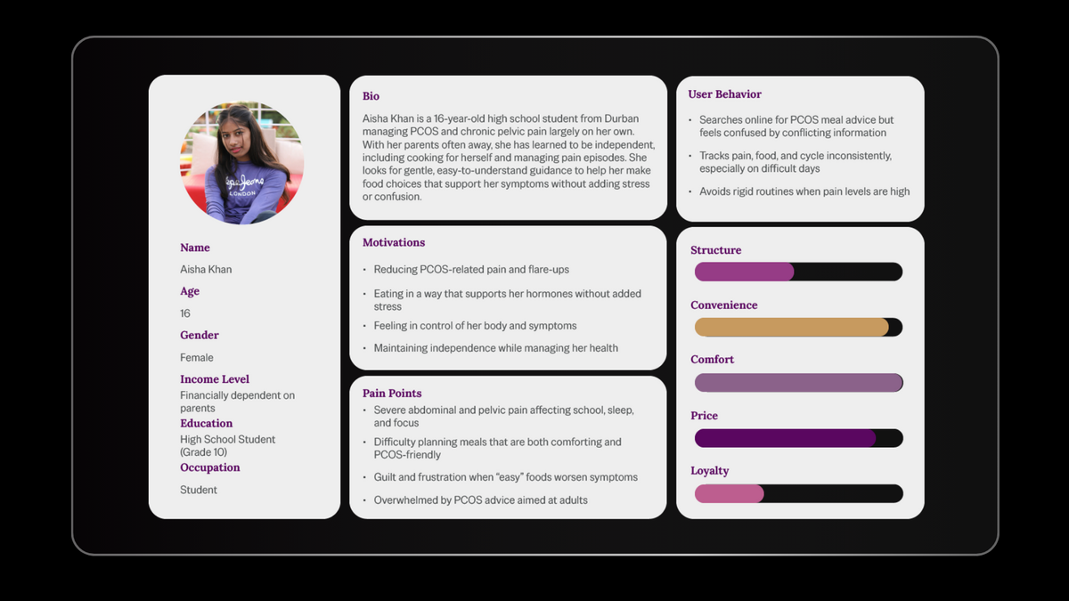
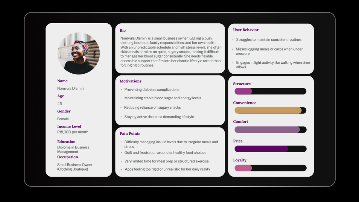
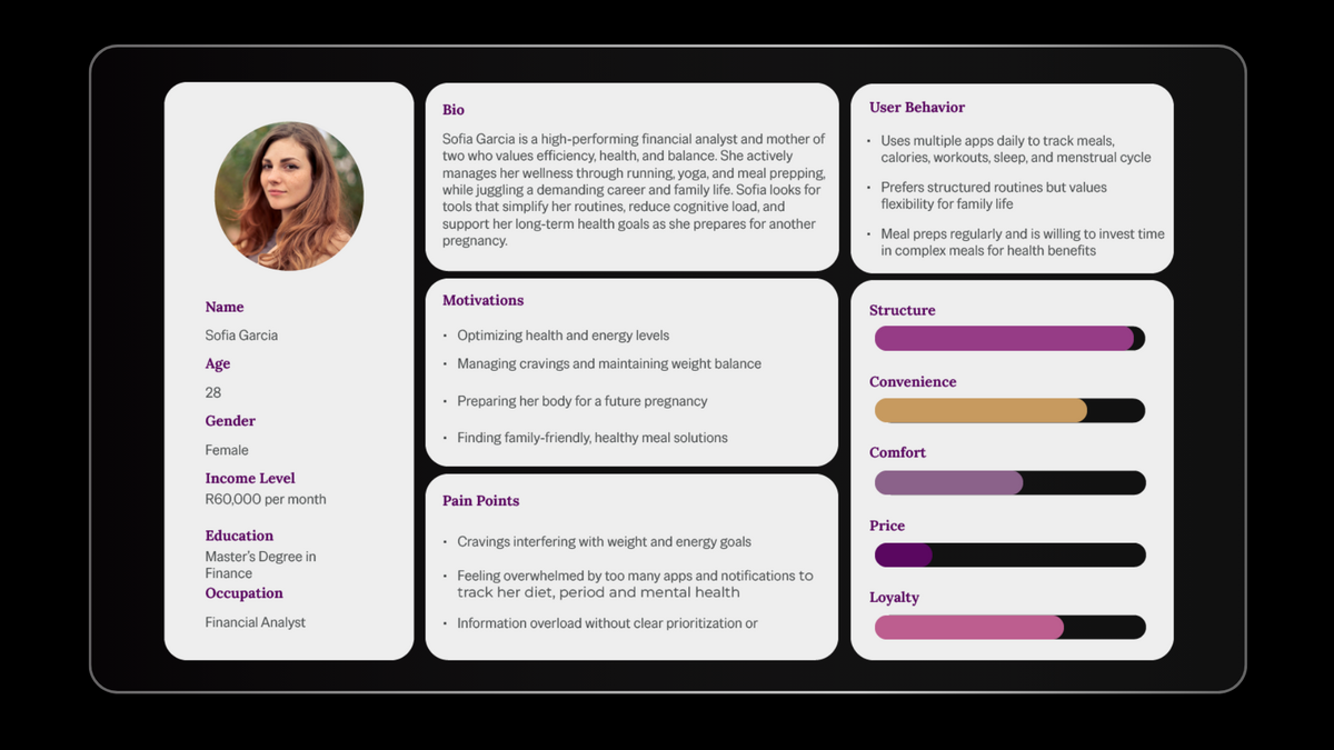
While all three personas informed the design, the primary focus was on users actively managing recurring cycle-related symptoms and cravings, such as Sofia Garcia and Aisha Khan.
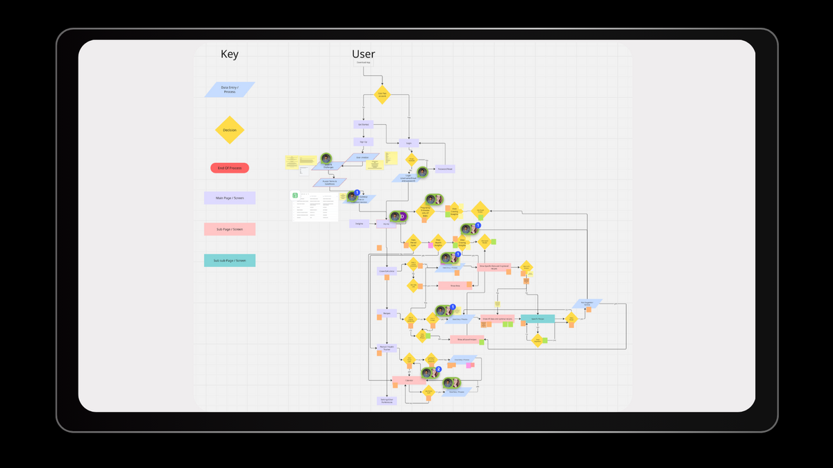
Product and user research informed the team’s initial assumptions and guided the first version of the product. I supported the product owner in defining the pricing model and determining how features would be distributed across freemium and premium tiers.
Given that the target audience was exclusively women, an initial pregnancy experience was also explored, which the persona Sofia influenced, including symptom logging, dietary recommendations, and educational content about baby development.
Crazy Eights was used to explore initial layout concepts.
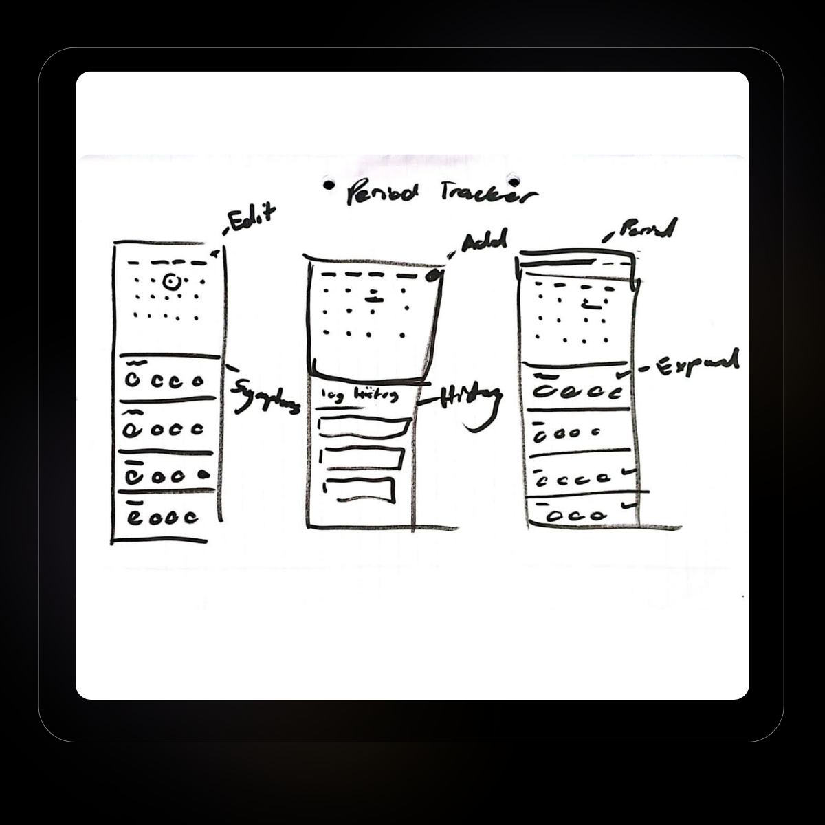
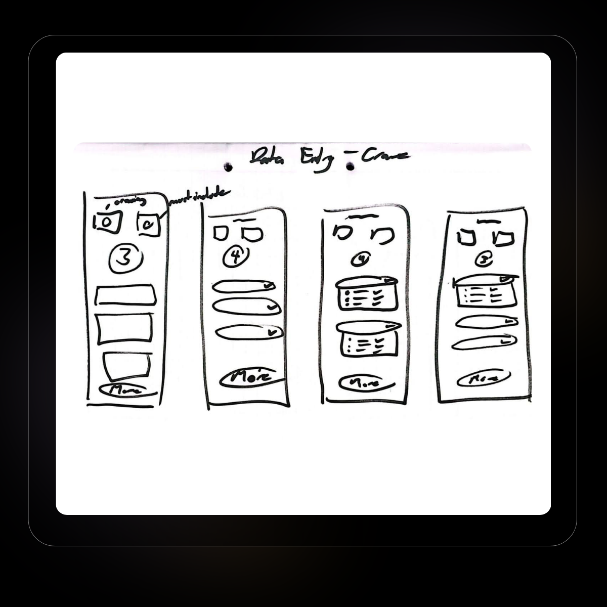
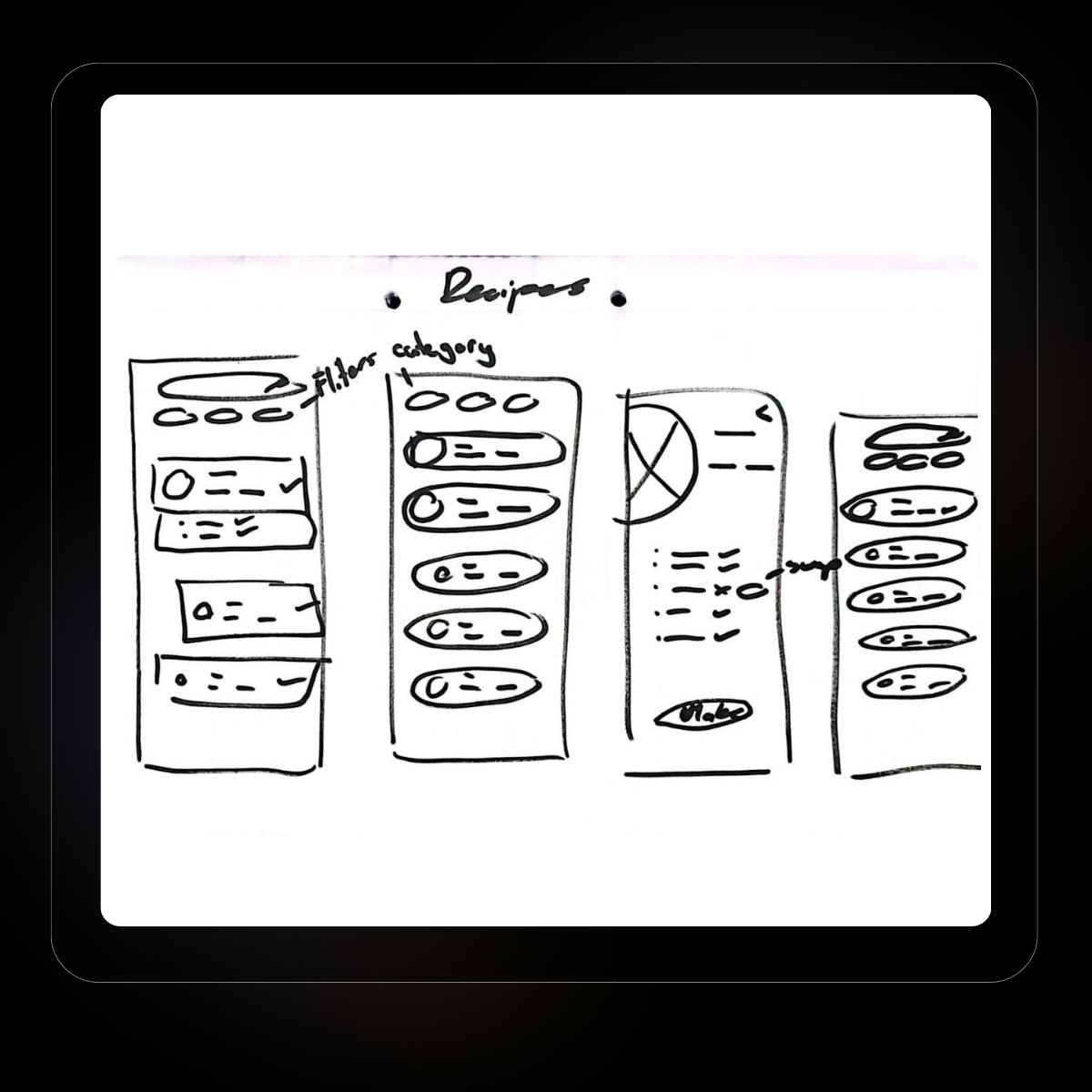
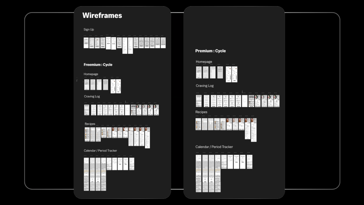
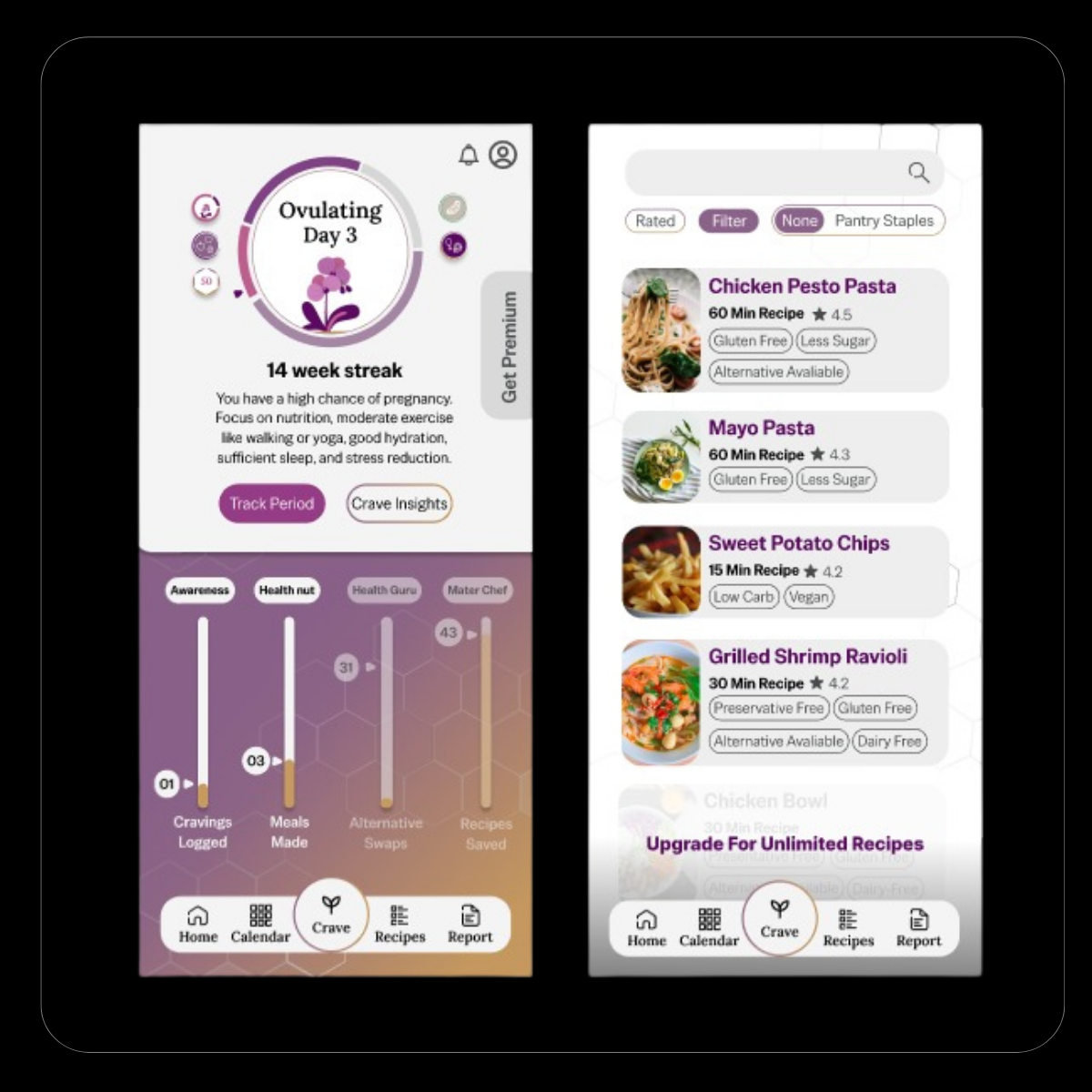
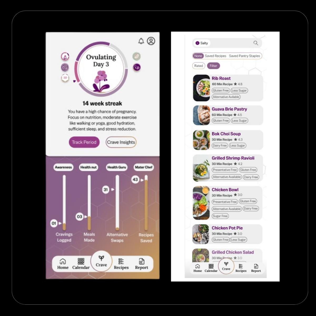
Wireframes were created for both the Premium and Freemium models.
To validate core functionality, a usability test was done to determine whether it was usable and met the expectations of the participants who tested it.
Purpose: Testing the functionality of UX first, before moving to the next step
Can the user complete it independently in unmoderated testing?
Does the user understand how to use all features of the app?
Does the user journey accurately reflect and address users’ core pain points?
6 participants between the ages of 21 and 52, with various educational levels and backgrounds, were selected for moderated and unmoderated testing. 1 Participant was tested on the pregnancy side, and 5 were selected for the menstrual cycle.
Finding 1:
Users were able to navigate the app independently
Finding 2:
The experience exceeded expectations in clarity and ease of use
Finding 3:
However, users felt overwhelmed by the period tracking flow and were unsure how to log and save data
Finding 4:
Requests included simplified setup, additional symptom options, filtering, and clearer button states
Finding 1:
Testing revealed a mismatch between the pregnancy experience and user expectations
Finding 2:
Pregnant users prioritised managing aversions and physical limitations rather than optimising dietary goals
Finding 3:
The experience felt overly focused on the user rather than their baby’s development
Usability testing showed a clear divergence in performance between the two experiences. While the menstrual side tested strongly and resonated with users, the pregnancy experience revealed unmet expectations and a mismatch in user needs.
Rather than risk weakening the overall product experience, the team made a deliberate decision to continue development of the pregnancy feature in a future phase, where it could be supported by deeper, pregnancy-specific research.
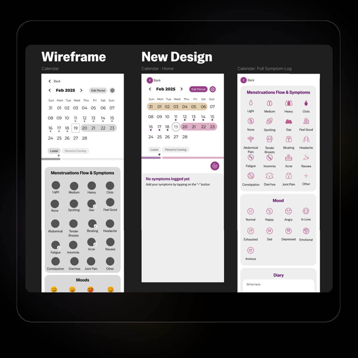
1. Minor microcopy changes were made, but the primary focus was on simplifying the period tracking flow. Users felt overwhelmed and were unsure how to log and save their data, so the experience was revised to separate calendar viewing from symptom logging, reducing visual load and improving clarity.
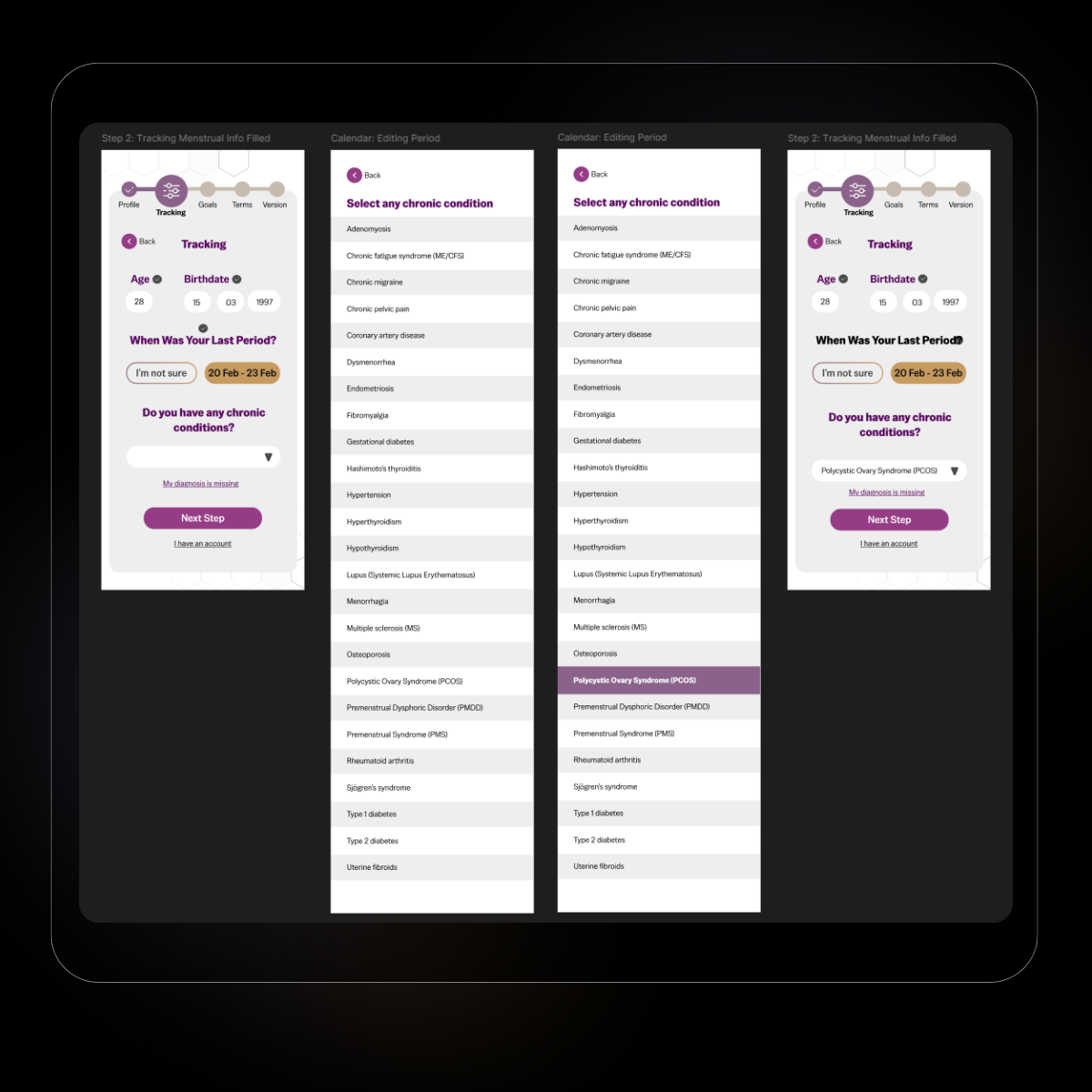
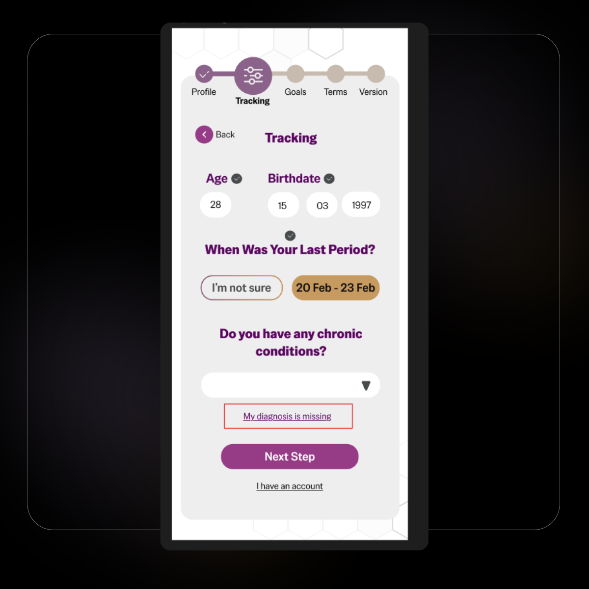
2. A section was added for users to log their medical diagnoses.
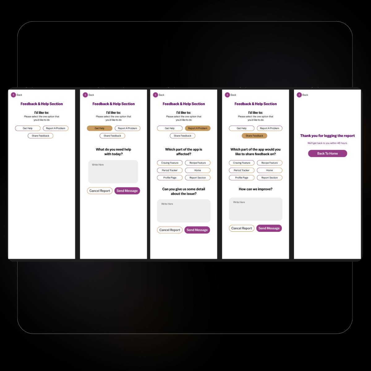
3. To improve communication and feedback loops for both users and the client, dedicated in-app sections were added to allow users to share feedback, report missing features, or contact the team directly.
Example Of Freemium
Example Of Premium
Usability Test 1
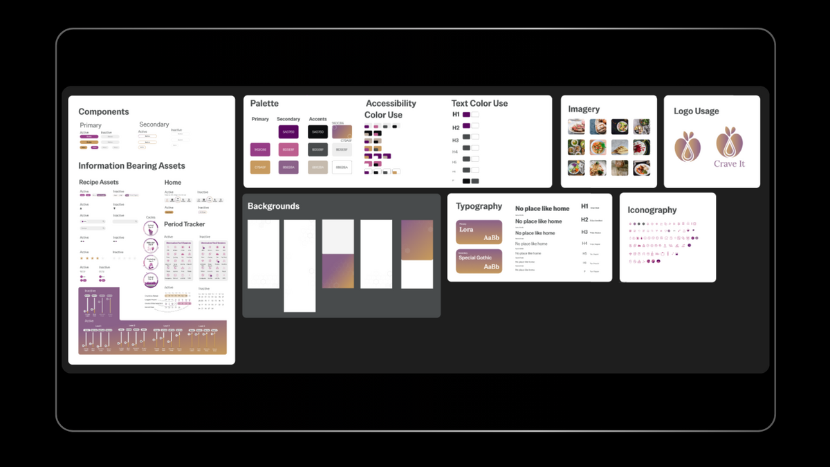
A design system was created to ensure consistent UI patterns and efficient development, with clearly defined component states.
Usability testing confirmed that the menstrual experience effectively supported users in understanding and managing their symptoms and cravings. The product direction was validated, with clear opportunities identified for further refinement through additional testing after an MVP release.
This project reinforced the importance of validating assumptions early, particularly when designing for different life stages. While research provided strong direction for the menstrual experience, usability testing highlighted that pregnancy requires a distinct mental model and deeper qualitative research. In future iterations, I would prioritise one-on-one interviews earlier for complex user contexts to better align solutions with real-world needs.